
This is a post about a travel app I designed a few years ago. It was a side project I worked on while I was unemployed, and it never gained much traction. I’m writing about it anyway, because I learned a lot from it, and some of those lessons have stuck with me in my work since.
HERE was short for Here, There, & Everywhere. The idea came from my dad. He travels for work, so in one week he might be in Africa, then Saudi Arabia, then Europe, sometimes in more than one country in a single day.
That led to a lot of unanswered FaceTime calls and texts like “Are you home yet?” and “What time is it where you are?”
I wanted an app that could handle those messages for you. It would track where you were, post updates automatically when you landed, and let friends and family follow along. Think Instagram, but more personal and private.
Design was the easy part (sort of)
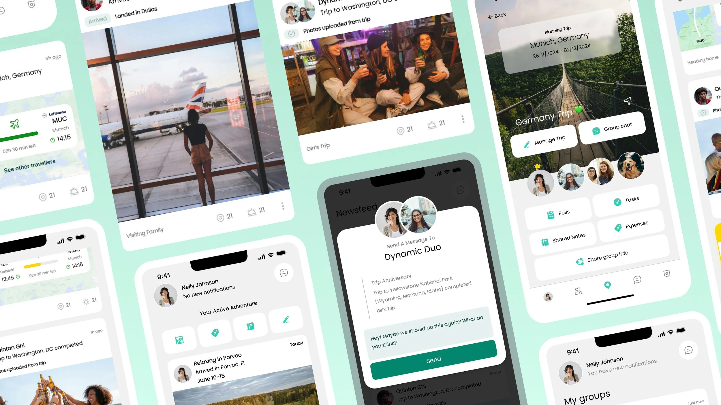
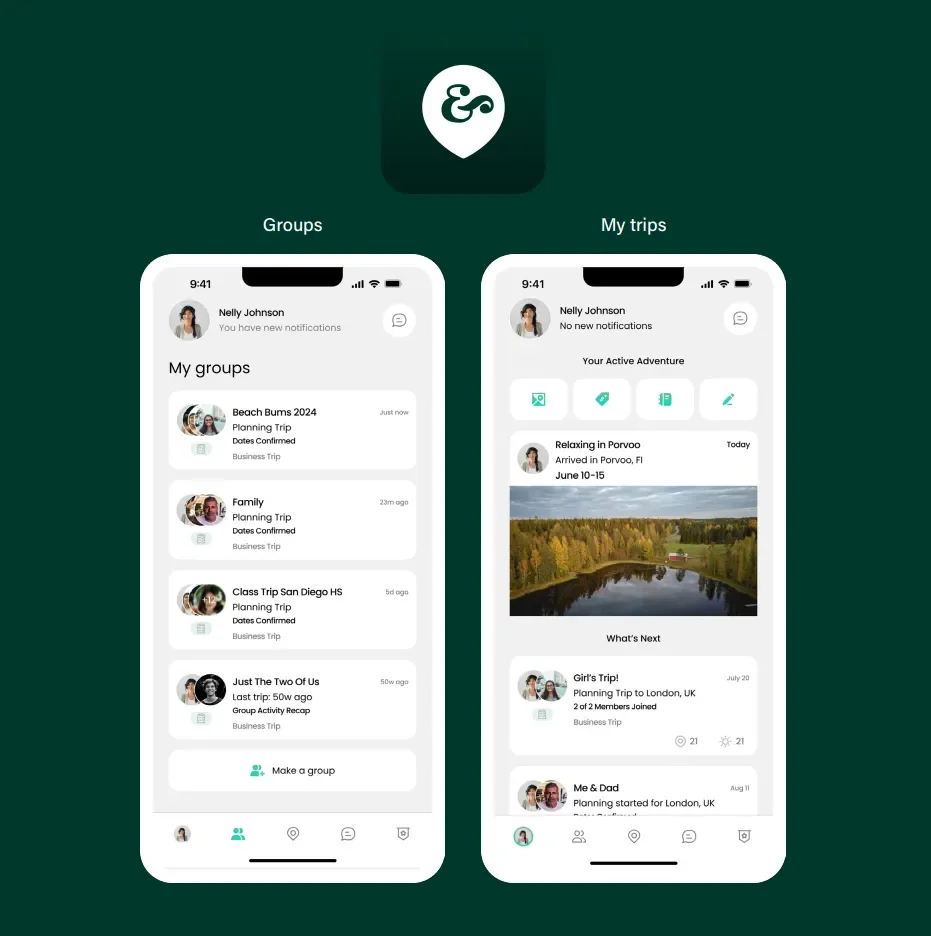
I spent most of my time in Figma, working on the news feed, My Trips, and Groups. The feed was the centerpiece. It showed your own trips and updates from people you followed, using cards like “Arrived in London” or “Boarding Flight to Munich” arranged in a timeline. The idea was that you could catch up at a glance.
Six months in, I realized building an app was much harder than I’d expected. Every week I added another feature. Itinerary tools, group chat, shared expenses, voting, status updates. The list kept growing, and I was on track to spend years just getting the basics done.
Bronze, Silver, and Gold
To get out of that spiral, I organized features like a medal ceremony:
Bronze was the core experience, the stuff that makes the app worth using at all.
Silver was planning and collaboration tools that made the app better.
Gold was the high-value extras that made it smarter and more interactive.
Most startups begin with a Gold vision and trim it down to Silver or Bronze. I did too. I don’t think that’s a failure. It’s just part of figuring out what you’re actually building.

The hardest question: what’s free?
The toughest decision was figuring out what belonged in the free version and what should be paid. Early on, I thought charging for itinerary management would be a smart way to drive subscriptions. After some testing, I changed my mind. It felt wrong to make people pay just to see their own trip plans.
So the free version kept the essentials: basic itinerary management, real-time notifications, and offline access. Travel often means spotty service, so offline access wasn’t optional. The paid tiers focused on things that reduce planning work, like smart itineraries, calendar sync, shared expense tracking, and threads inside chat.
I still think about this one a lot. Every app is a business, and it needs some way to pay for itself. But if the free version feels like a trap, people leave.
Fewer decisions, more engagement
Another lesson: the more choices a user has to make, the less they engage. My early settings pages were full of toggles. Users could customize every detail of how they got notified, and that level of control turned out to be a burden, not a feature.
I simplified it. Group notifications were prioritized automatically. You could mute a group chat without missing important trip changes. The app suggested notification settings based on how you traveled, so you didn’t have to set them up yourself.
Every design decision came down to one question: does this make the app easier to use, or more complicated?
Marketing a product that doesn’t exist yet
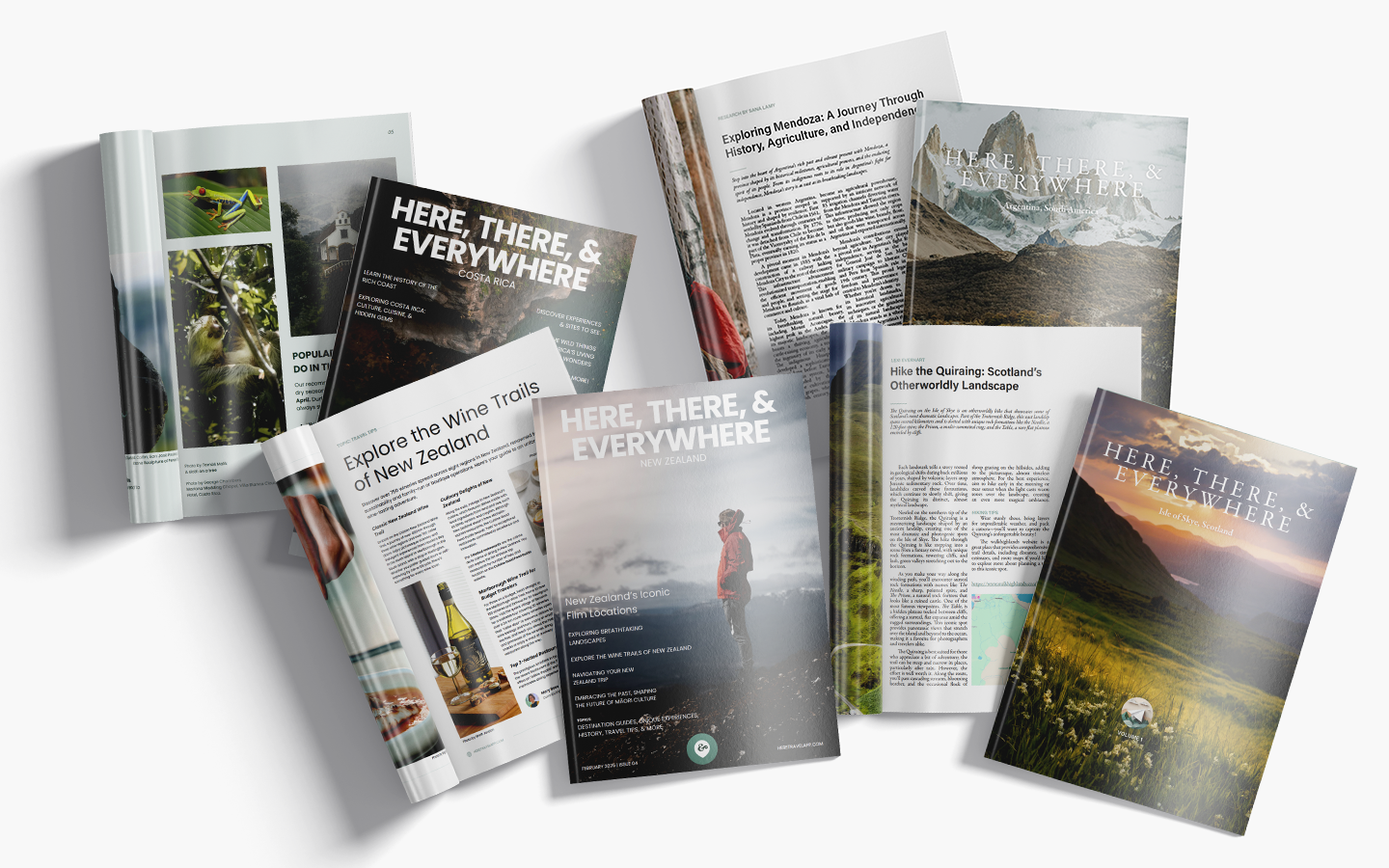
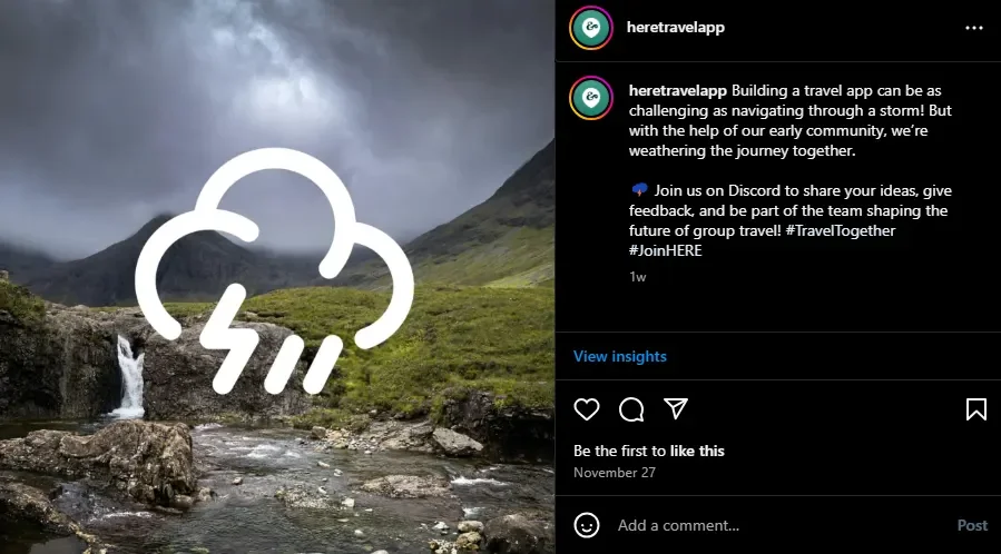
I also tried to build an audience before the app launched. I opened accounts on just about every platform, ran a few engagement campaigns, and made YouTube Shorts and Instagram Reels showing the news feed and live tracking. I started a Discord community and even made a digital travel magazine, with one volume about the Isle of Skye and another about Argentina. The magazine sold on Ko-fi, and the profits were meant to cover the costs of keeping the designs going.
It was slow. Breaking into social media is hard enough for professionals, let alone a solo founder with a few accounts. After a few weeks, it became clear that Bluesky, Instagram, and Ko-fi were the only channels worth focusing on.
Why it didn’t take off
I know it’s hard to imagine now with vibe coding and LLMs so previlant now, but the biggest factor that kept me from making this a real app was no developer co-founder. Not to mention funding, time, or traction.
Being a one-woman team is hard work. Doing the designs, project management, research, benchmarking, marketing, socials, outreach… all as one person was exhausting. I was officially unemployed while I worked on this project, so once I got an offer for a full time job, the time to continue working on this was no available any longer.
What carried over
I didn’t end up building the app, but the work wasn’t wasted. The Bronze, Silver, and Gold framework still shapes how I prioritize features. The habit of cutting decisions down to the essentials shows up in almost every project I work on now. And I learned that good design means knowing what to leave out.
If you’re working on a side project of your own, I’d love to hear about it. And if you’re a traveler who has ever wished your friends could just know where you are, you’re not alone. That’s exactly what HERE was for.
Reach out if you are a developer or co-founder who still wants to make this happen. There are endless possibilities.
