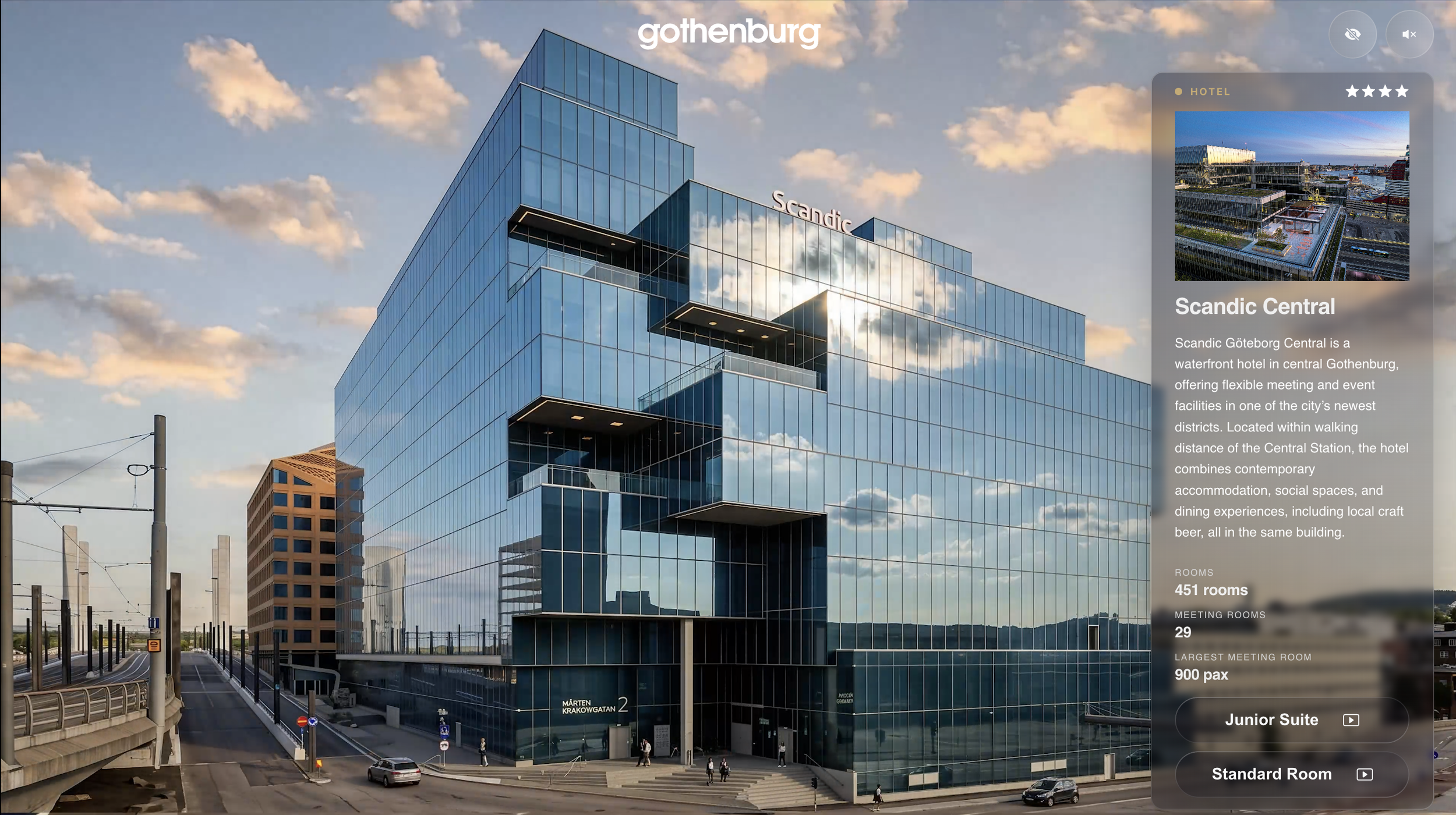
Event planners have a hard time picking a venue they’ve never seen. Flying out to tour a dozen hotels and convention centres just to shortlist them isn’t realistic for most people, so the decision often comes down to photos and a sales deck.
That’s the problem the Digital Site Visits tool was built to solve, and it’s one of the most interesting projects I’ve worked on.
What is it?
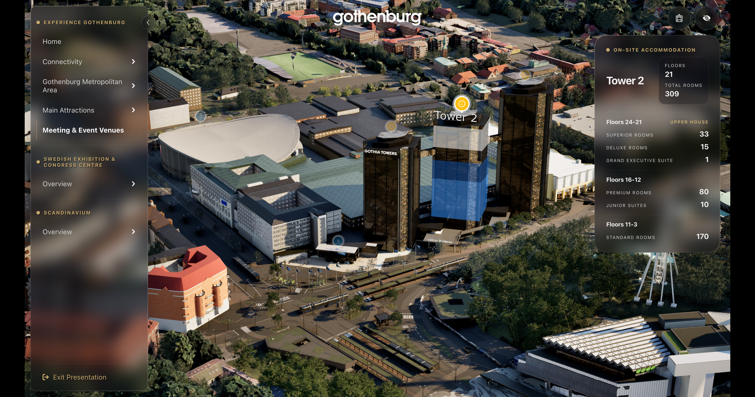
Digital Site Visits is an internal sales tool for a city destination organization in Gothenburg. It’s built on the city’s digital twin, a detailed digital model of the city, and it lets sales teams take organizers on a guided tour of venues, hotels, and public spaces without leaving the room. It’s an internal tool, so it isn’t available to the public. It will be released at the end of the month.
The tricky part was never the 3D. It was that the people using it need to show a lot of information, but not the same information to every client.
Working with the team
We worked very closely with the Gothenburg team from the start. Their main goal was that when they present to clients, they have every piece of information they need, but they can also hide anything they don’t want to share with a particular client. That sounds simple, but it changes almost every decision in the interface. Every screen has to answer two questions: what do we want to show, and what do we want to hold back?
I think that’s what makes the tool so versatile. The same city can be shown as a pitch for a big conference one week and as a relocation story for a company the next.
Improving navigation and organization
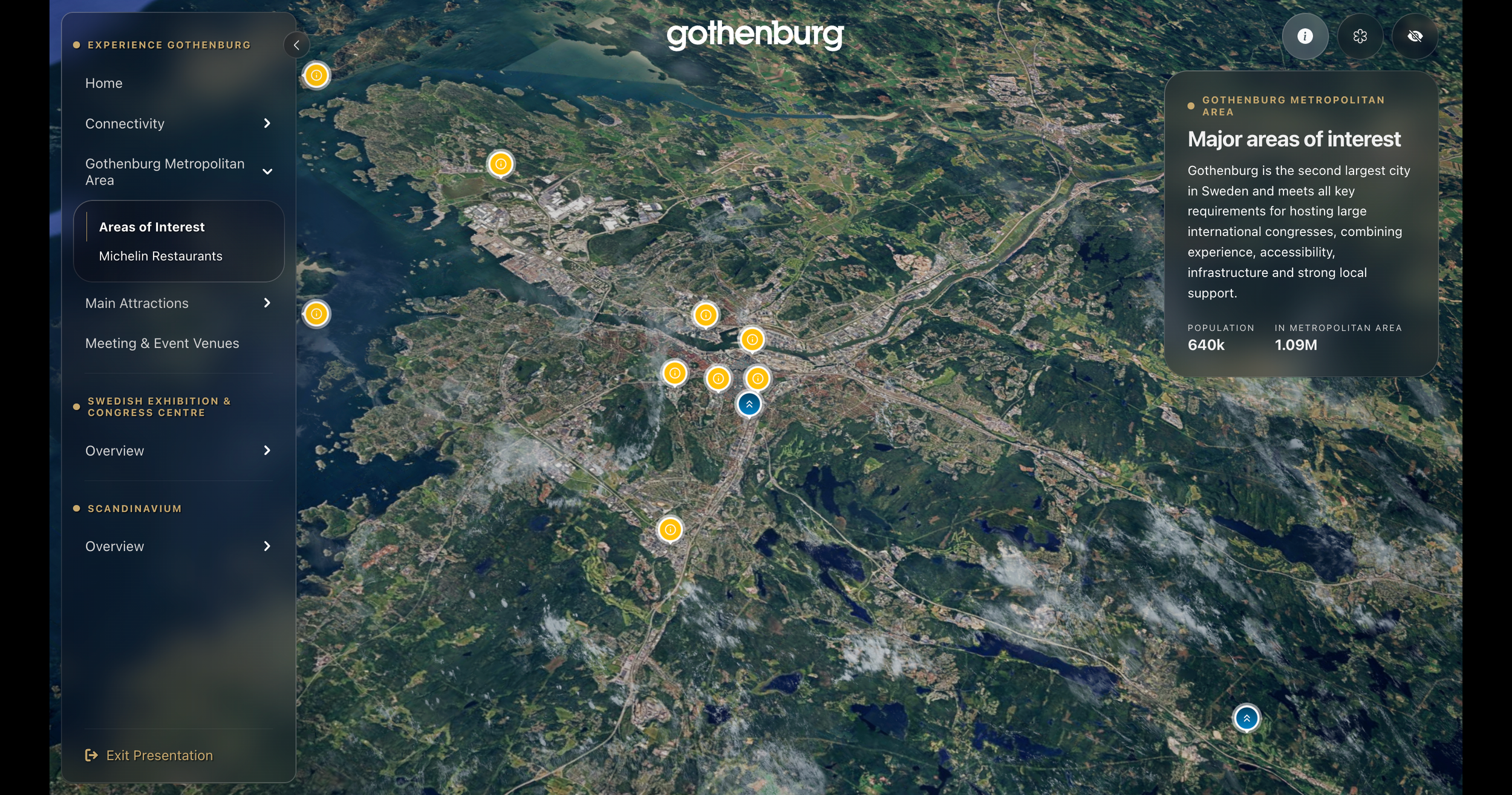
The biggest thing I worked on was the navigation and the way information is organized. There was a lot of content to display, and it needed to feel easy to move through, not like a wall of menus. I spent most of my time mapping out how people would move from a broad view of the city down to a specific venue, and how they’d find or hide details along the way.
I also wanted to avoid anything that would feel dated in a year. Design trends come and go quickly, and I didn’t want to end up back here redesigning the whole thing next year. So I chose a design system built on timeless principles, with clear hierarchy, consistent spacing, and restrained styling.
Glass that works on any background
When we explored the visual direction, we took inspiration from the glass look you see in Apple TV and in VR experiences. It’s a beautiful effect, but it can be hard to read when the background is busy, and a city full of photos and 3D models is very busy.
So we modified it. The result is two types of glass:
A frosted glass for the info-heavy boxes, where readability matters most.
A more see-through glass for the less important elements, so the city stays visible behind them.
It’s a small decision, but it makes a big difference in whether people can actually read what’s on the screen.
Prototyping in motion
For prototyping, we used the 3D assets as video recordings and built them into a Figma prototype. That let us test how the experience would feel as someone moved through the city, without waiting for the full build. We also made changes on the fly in the dev environment, which kept the prototype and the real product close together.
See more about the project in my portfolio.
